|
|
|
|
Главная --> Промиздат --> Map principle 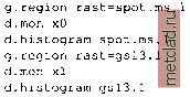 The histograms are very different: While the distribution of the SPOT-1 HRV1 cell values is highly skewed, the histogram of the aerial photograph slowly decreases over the grey levels. Color tables. Management of raster map color tables was already discussed in Section 5.1.1. Here, we revisit them with respect to images. Colors are not hard-coded in images but assigned to certain pixel values using so-called look-up tables (LUT). The GRASS module for creating LUTs is r.colors. Besides the pre-defined color tables like rainbow or gyr (from green to yellow to red), you can also define your own color assignments (set parameter col=rules). After data import, you can change the color table to useful values using r.colors with the option color=grey.eq. Using this option, a contrast stretch will be applied to the images color table based on the histogram found for the particular channel. Satellite images are often very dark after import, the contrast enhancement is therefore useful for later data analysis. For example, to improve the contrast of the image channel spot.p run: 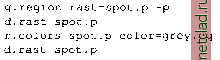 In this example, we have modified an image in a different mapset which is not allowed for most commands. Here, the operation is possible because The image histogram. The first step in analysis of image data is to look at the channel histograms. Each histogram shows the frequencies of grey levels in an image representing the given channel. For each grey level, the number of pixels in the image is counted and drawn into a diagram. As noted above, the number of grey levels (or brightness levels) depends on the satellite sensor. The x-axis of the diagram represents the grey levels, while the y-axis shows the number of pixels found at that grey level. To calculate and display the histogram of a channel, open a monitor and run d.histogram with the parameter channel set to the name of the channel you are interested in. The histogram will be displayed within the monitor using the color coding from the image. If the histogram is displayed in dark colors, consider modifying the image color table (see next paragraph). In the following example, we compare the histogram of the SPOT-1 HRV1 channel and that of an aerial photograph of Spearfish: 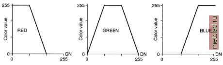 Figure 9.3. Color functions for density slicing of grey scale images (DN: Digital Number) r.colors is able to store a local color table assigned to the original map in the current mapset. Density slicing. Visual interpretation of grey-scale images can be enhanced by pseudocolor methods that assign various colors to the grey values. One of such methods is density slicing, which assigns a range of contiguous grey levels to a range of colors. The full range of grey levels of a channel is cut into three parts and is assigned piece-wise to the base colors blue, green, and red. To perform such density slicing in GRASS, the minimum and maximum pixel values have to be identified (e.g. using r.info which shows the range of a map). A color table then needs to be written and used for r.colors. The color values are interpolated between the given values and sliced individually between minimum and maximum. For example, one-third of the color range is assigned to red, one-third to green, and one-third to blue, where the overlapping color ranges lead to mixed colors (see Figure 9.3 for details). As an example, we apply a density slice to the panchromatic SPOT-1 image. The range of spot.p is 15 - 254; therefore, we slice at the cell value thresholds: 80 (which is (254-15)/3) and 159 (which is (254-15)* 2/3), beginning at 15 and ending at 254: 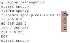 You may experiment with different ranges for the three colors to optimize the result that is to achieve a good contrast. Also, d.histogram is helpful for evaluating how well the density slice matches an (often) skewed histogram. As two clouds are present in the image, which heavily influence its grey level distribution, you may try to define the maximum at a much lower value and reduce the other thresholds respectively. The individual color values can also be modified for implementation of different slicing functions. Simple color composites. To obtain a color image from grey-colored channels, several channels have to be combined by assigning each channel to a different base color. For example, to generate a near-natural colored image, the blue, green, and red channels (each only grey-colored) have to be assigned to blue, green, and red color of the GRASS color composition module. Simple examples can be done with the non-georeferenced SPOT-1 HRV data. First, we apply grey scale color tables to the channels; then, we can generate a near-natural color composite with: 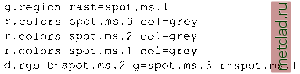 Note that the order of assignment is unusual for a near-natural color composite. This is due to the fact that the SPOT-1 satellite does not provide a blue channel. The trick shown above is a possible workaround; another option is to generate a synthetic blue channel from the existing channels. Due to the assigned standard grey color tables of the input channels, the resulting image appears very greenish. This may be optimized with modifications to individual grey tables. When working with LANDSAT-TM7 data, the first three channels will be assigned to blue, green, and red, as expected from the color model definition. This composite, as drawn by d.rgb into the GRASS monitor, can be stored in a new raster map using r.composite or i.composite (the latter requires an image group, as will be explained later on). A false color composite for SPOT-1 can be done in a similar way, but preferably from a histogram-equalized grey scale color tables calculated in advance: 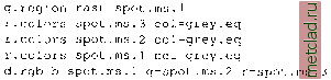 This will display a false color image in the GRASS monitor, as we have effectively assigned the green, red, and near-infrared SPOT-1 HRV channels to blue, green, and red display colors. Green vegetation appears red while unvegetated
|