
|
|
|
|
Главная --> Промиздат --> Map principle We use the cbind() function to paste all calculations into the table ZnFldf.table, it looks as follows: 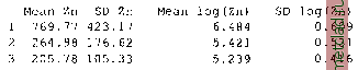 Given the flood frequency classes as: 1=annual, 2=2-5 years, and 3=every 5 years, it can be seen that high zinc contaminations only appear for areas with annual flooding. Further tests such as t-test analysis (Burrough and McDonnell, 1998:107) of the statistical significance between flood frequency classes 2 and 3 are not covered here. These calculations are described in the R/GRASS interface manual page (enter: ?utm.maas). When working with geospatial data, it is always recommended to explore the data distribution. To view the zinc concentrations distribution (using the Zn data and log-transformed Zn data) run: par(mfrow=c(1,2)) hist (utm.maas$Zn, brea)cs = seq (0, 2000, 100), hist (log(utm.maas$Zn), breaks=seq(3.5, 8.5, par(mfrow=c(1,1)) col= grey ) 0.25), col= grey ) The histogram of the non-transformed data shows the typical skewness as usually found for geospatial data. It is normalized through the logarithmical transformation, see Figure 13.9. Another visual test for normal distribution of data sets are QQ plots (Quantile-Quantile plot): par(mfrow=c(1,2)) qqnorm(utm.maas$Zn) qqline(utm.maas$Zn) title( Zn data , line=0.7) qqnorm(log(utm.maas$Zn)) qqline(log{utm.maas$Zn) ) title ( log(Zn) data , line=0.7) par(mfrow=c(1,1)) Figure 13.9 depicts both graphs. The QQ plot of the log-transformed data is much closer to normal distribution than the plot of untransformed zinc data. A method for generating a smooth continuous raster surface from spatially distributed sample points is the kernel density plot. It uses a moving Gaussian kernel which represents a bivariate probability density function (Bailey colnames(ZnFldf.table) <- c{ Mean Zn , SD Zn , Mean log(Zn) , SD log(Zn) ) ZnFldf.table 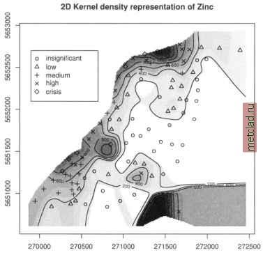 Figure 13.10. R/GRASS: Maas river bank soil data: zinc contamination 2D kernel density (bandwidth: 300m) and Gatrell, 1995:84-88). We generate a kernel density plot from the zinc data as follows: plot (G, kde2d.G(G, utm.maas$east, utm.maas$north, h=c {300, 300), Z=utm.maas$Zn)*maasmask, col=grey (20:1/20)) contour.G(G, kde2d.G(G, utm.maas$east, utm.maas$north, h=c (300, 300), Z=utm.maas$Zn)*maasmask, add=T) points(utm.maas$east, utm.maas$north, pch=codes (Zn.o)) legend(x=c(269900, 270700), у=с(5652100, 5652700), pch=c(l:5), legend=levels (Zn.o)) title ( 2D Kernel density representation of zinc ) Figure 13.10 shows the resulting map. During calculation we have multiplied the zinc data with a mask maasmask to obtain kernel densities only for the project area. 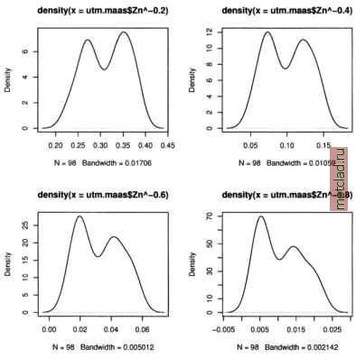 Figure 13.11. R/GRASS: Maas river bank soil data: Distribution of power-transformed zinc contamination data (various exponents) Data transformations and trend surfaces. For geospatial analysis, data sets with skewed distribution are usually normalized (for a discussion see Bailey and Gatrell, 1995:172). As we have seen above, the zinc concentrations show a skewed distribution. We apply a logarithmic transformation, which is often used for normalization of geospatial data. A density plot of the log-transformed data shows a bimodal distribution (compare Figure 13.9). Now we want to try different approaches to normalize the data set, based on power transformation: 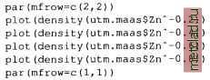 The resulting distribution curves are shown in Figure 13.11.
|